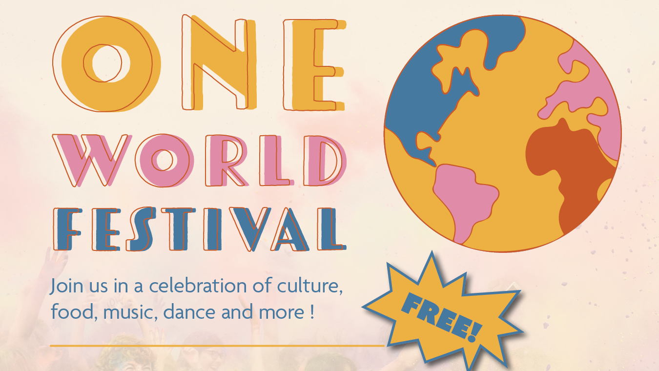
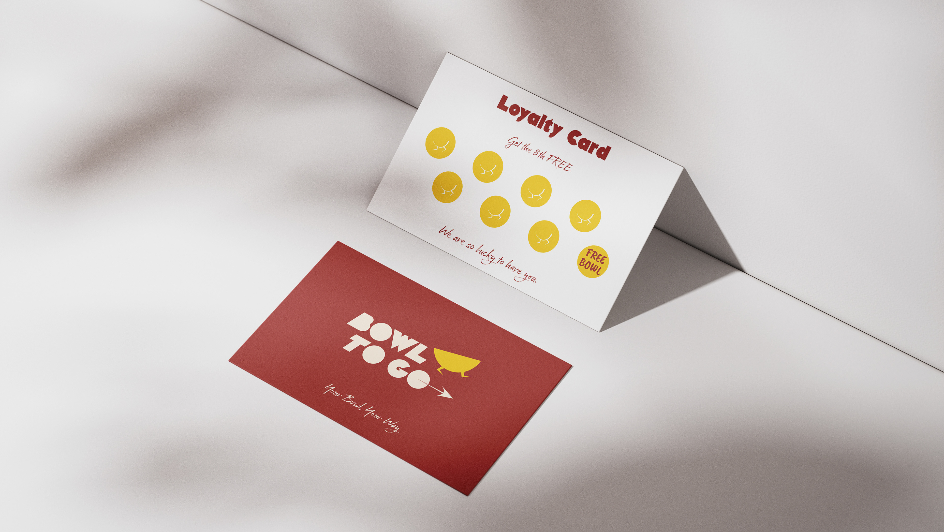
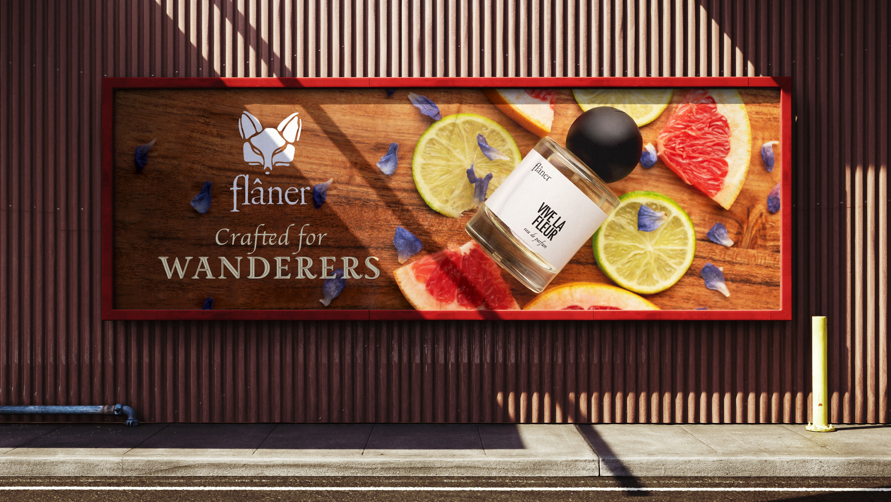
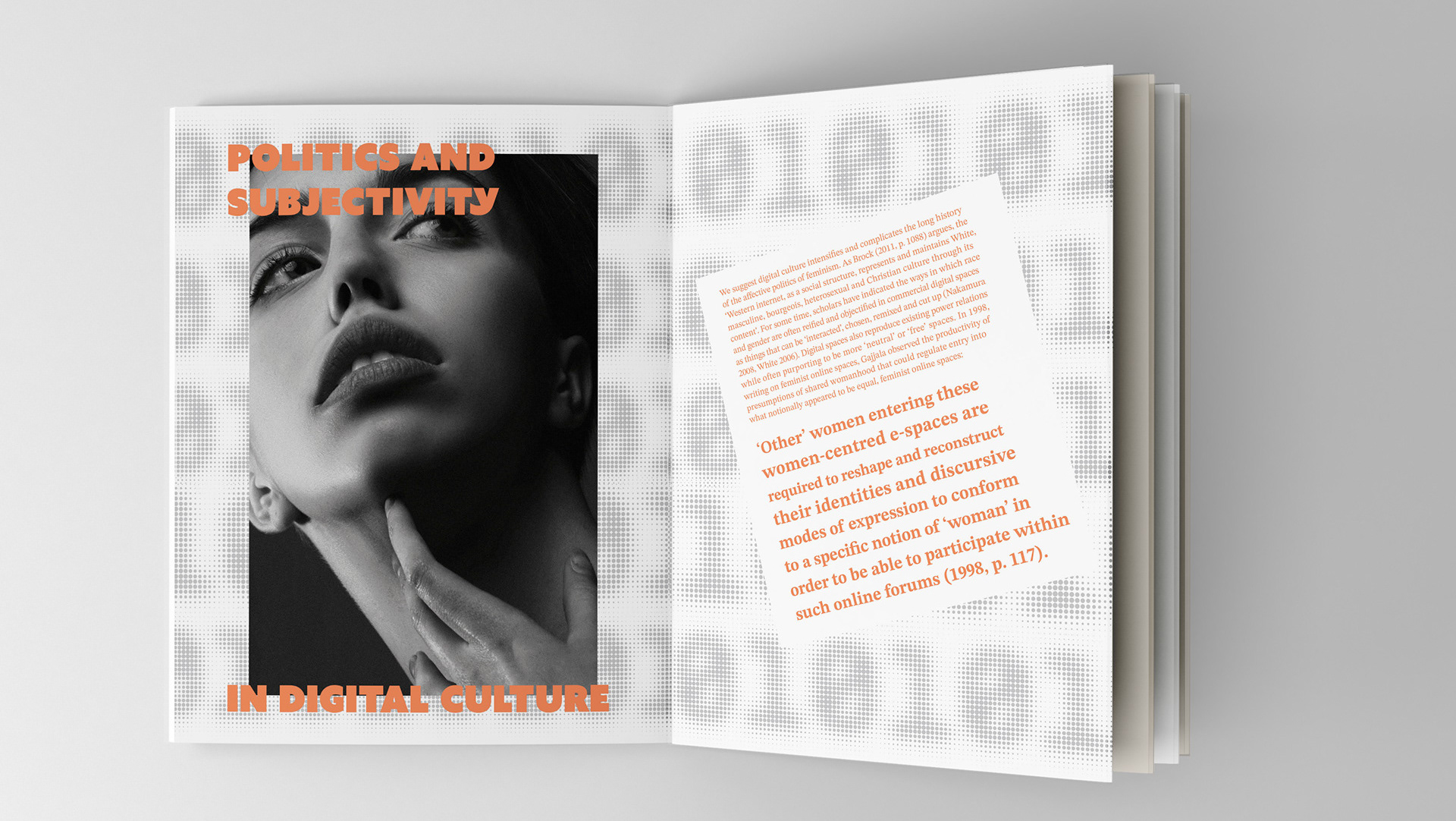
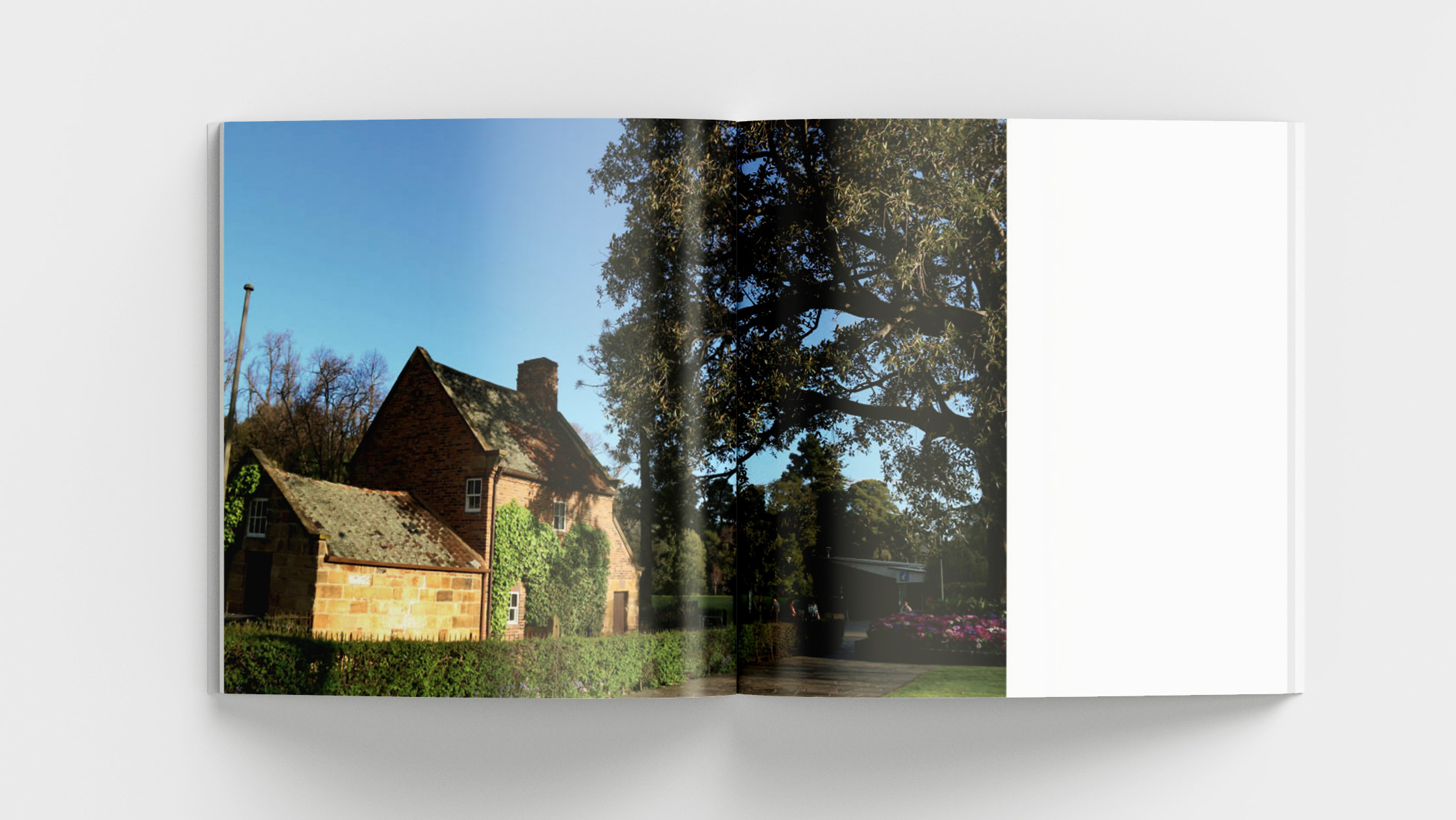
The aim of this project is to learn how to use materiality and positive and negative space to communicate an object's form effectively. The poster designs are for the City of Melbourne and they will be displayed at tram stops located across Melbourne to encourage people to visit the landmarks, so the designs must be visually engaging and the landmarks recognisable.
This poster's textured forms, playful font, tensed composition, and expressive colour palettes effectively convey the landmark’s materiality. In addition, the white spaces successfully create negative space in the composition to emphasise the typography. The interaction of typography and forms makes them appear as a “group,” while also expressing the vibrancy and bustle of these landmarks.

